Improving the navigation, usability and design of a USA government website
User Research | Information Architecture | UI Design
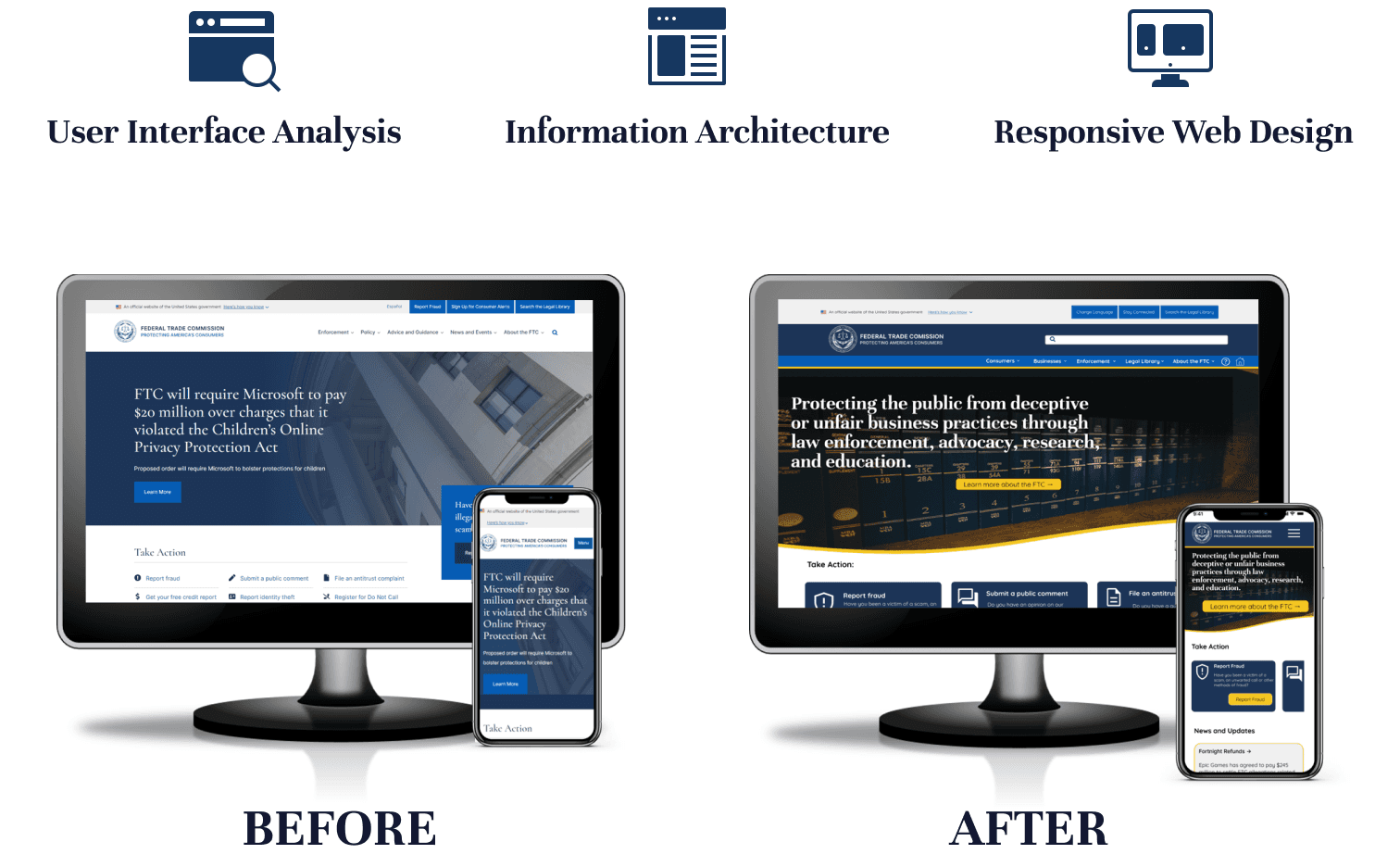
Project Overview
The Problem
The current Federal Trade Commission Website is very difficult to navigate with confusing homepage interface and a complex menu. It is not obvious from the homepage what services the Federal Trade Commission provide, making the website confusing from the moment you arrive. The website has no consistent colour scheme which differs when you click into links. This makes the whole user experience very confusing.
The Solution
Redesign the website with a consistent colour scheme, a simple and logical navigation and make it clear on the homepage what services the Federal Trade Commission provide.
The Approach
As there are many different tasks that can be accomplished on the FTC website we focused on the specific task of “register for do not call register”. We mapped out the existing user path for the task of registering for do not call and conducted 6 usability tests. The aim was to find out whether users were able to complete important actions, such as adding and verifying their mobile number on the 'do not call registry'. We then analysed the results using an affinity diagram and feature prioritisation matrix.
We caried out an in-depth heuristic evaluation of the homepage and navigation. We also annotated the homepage as well as the “register for do not call” user path. We focussed on usability heuristics issues, accessibility issues and user errors and pain points collected from the user testing.
We used card sorting to create a new site map that made navigating the website easier and more user focused.

We sketched and designed mobile and web wireframes for the homepage, consumers homepage, register for do not call and redesigned the navigation. We carried out 7 usability tests using maze. We utilised a 5 second test to see if users could determine what the website covered as this was an issue with the original design.
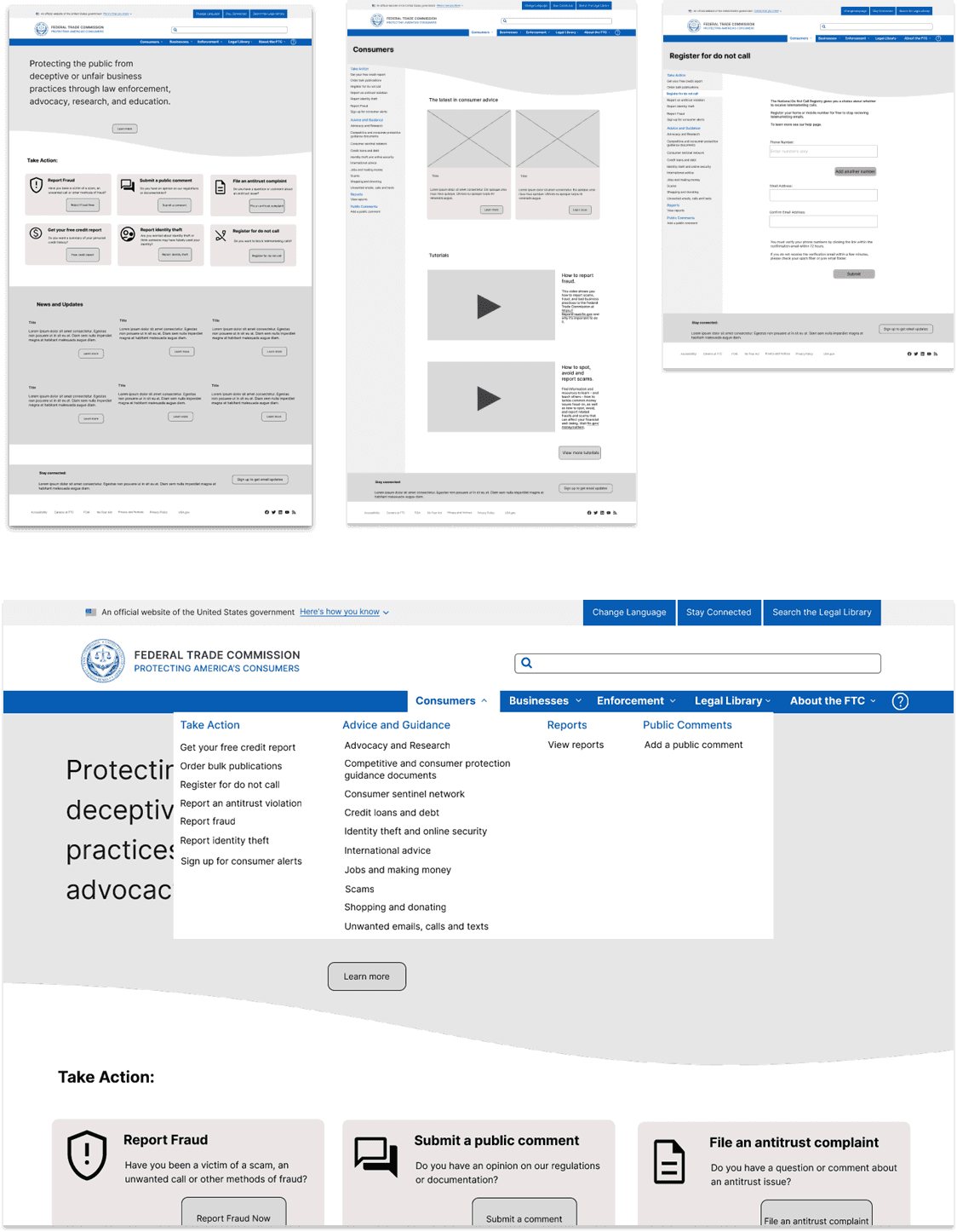
We created a style guide using the exiting brand colours but with a focus on accessibility. We applied the UI style to the homepage wireframe structure for both web and mobile. Including all visual elements defined in the style tile.

Outcome
The final prototype was designed following user-centered design principles. The user was involved through-out the design process to ensure that the navigation was simple and logical and the design was accessible. The new colour scheme was consistent and the new homepage made it clear what services the Federal Trade Commission provide.
